Accessing the Dashboard
To login to the dashboard:
-
Click here.
-
Select “ My organization’s single sign-on (SSO)”
-
Enter your TSTC username and password
You should then be directed to the viewer landing page for the dashboard. If you have problems logging in to the dashboard, please contact the IT help desk.
Selecting the Dashboard View
The dashboard has two views: the Course Evaluation view and the Instructor Evaluation view. The Course Evaluation view displays all of the data from the Student Course Experience Questionnaire and the Instructor Evaluation view displays all data from the Student Perceptions of Instructor Questionnaire. Once you have logged into the dashboard, you will be able to toggle between these two views by selecting the view you want from the top left of the dashboard menu.


Understanding the Dashboard View
Content of the Dashboard
Each dashboard view displays the aggregate results and the response counts for each question available to students.
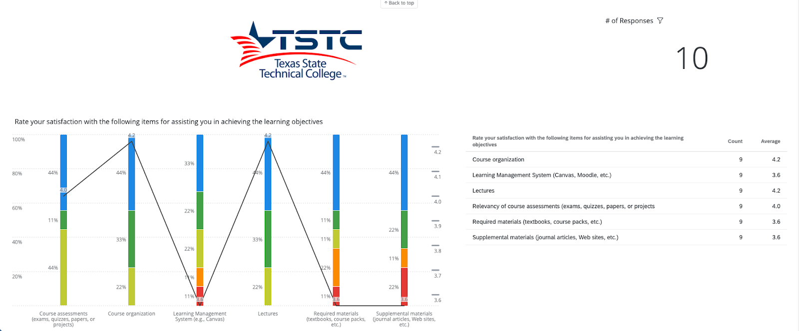
In the following image you can see an example of a plot that displays part of the Course Evaluation view. At the top right is a response counter. This indicates how many responses exist. On the bottom left is a plot that displays student satisfaction with different aspects of their course (e.g., the course organization). Each bar within the plot reflects the proportion of students who selected each response option. Response options are color coded for each value. The black line reflects the average score for each item, which is also reflected in the corresponding table to the right of the plot.
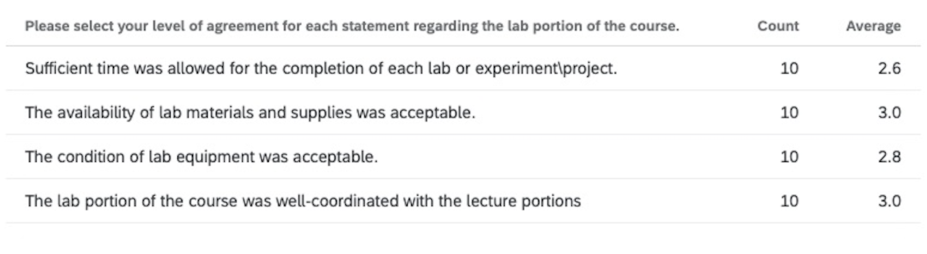
Let’s take a closer look at a dashboard plot for items reflecting satisfaction with the lab portion of a course.

In this plot, you can see that 50% of students indicated that they strongly agreed that the lab portion of the course was well-coordinated with the lecture portions. That is reflected in the left-most stacked bar, where the blue section reflects “strongly agree”, the orange section reflects “somewhat disagree” and the red section reflects “strongly disagree”. Additionally, the black line indicates the average score for each of the items reflected on the x-axis. Looking at the left-most stacked bar, you can see that the black line reflects an average score for that item of “3”. This can also be viewed within the corresponding table to the right of the plot in the dashboard view, which you can see below:
Filtering the Dashboard
You have multiple options for filtering the data. When you select a filtered view, the data provided in the plots and table will repopulate with the correct data. You can see the available filters below.

You can filter your view to show only data pertaining to selected terms, selected campuses, selected courses or selected instructors. If you are an instructor, you will only ever see your data. If you are an SDC then you will be able to select any instructor within your department.
Who to Contact with Further Questions
If you have further questions about how to utilize or navigate the dashboard, please contact your statewide department chair.